![WRtitle&border2[1]](http://static.flickr.com/37/86526800_380bebec03.jpg)

I've commandeered this section of the site for some hockey concepts. Go to Our Stuff if you're looking for our actual merchandise.
Watch for sporadic updates to this page.
New Jersey
Not that I think the Devils should cash in with a secondary logo or Edge-y third jersey, but if they did...
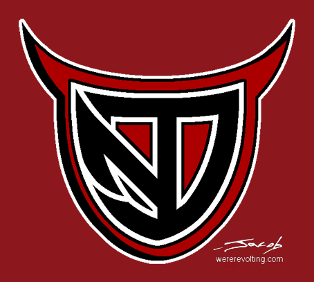
The shapes and proportions might need some work, but I think the concept is solid. It could make for an interesting third jersey:

I like how the sleeve pattern evokes horns. I may have mentioned this before, but I find that dark jerseys often look better when white is minimized or eliminated (as in several concepts below) and I think it's fitting for a team named the Devils to wear pure red and black. I'm not a fan of chest piping in general (and on the Oilers in particular) but it seems to work better with low-contrast colors.
Third Jerseys
I recently got wind of some rumors regarding next year's third jerseys. They're probably not legit, but a few of them piqued my interest. So I bashed together some concepts:
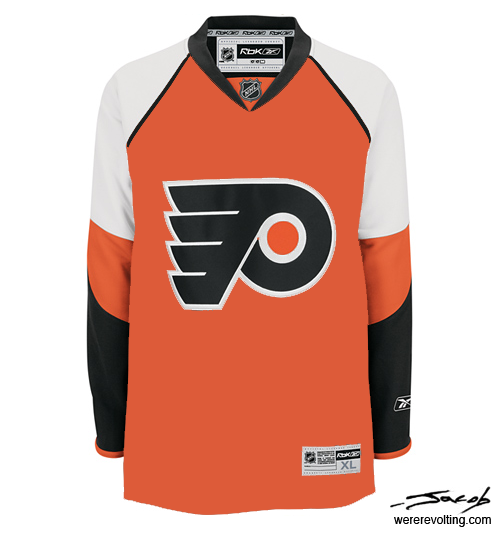
A couple quick recolors. The orange Flyers jersey is pretty basic, but I had to include it. This should be Philly's home jersey; the amount of orange they currently wear is just depressing.
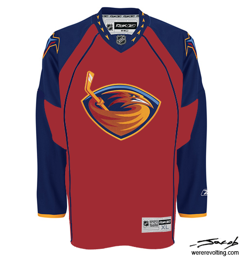
I still think the baby blue is a weird color for a Thrashers jersey. I don't hate the jersey itself - at least it's original - but I think deep red is a better look for them. (Perhaps a little too Panthersy.)
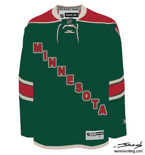
A couple more substantial revisions. I'm not crazy about the diagonal-text-in-lieu-of-logo look, but I think it works here. And it's nice to see green in the NHL again.
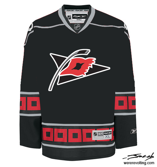
I've always thought Carolina looked a bit boring, despite the unusual waist stripe. I'm wondering why they've never put hurricane flags on the sleeves. I think this design manages to look cleaner and more interesting than what they're wearing now. And finally:

How's that for retro? It's probably a love it or hate it thing. (For me it's an "I've been staring at this for hours and I still can't decide whether I love it or hate it" thing.) In any case I think these need to be seen on the ice again, if only for a good dose of 1940s nostalgia.
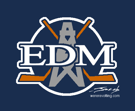
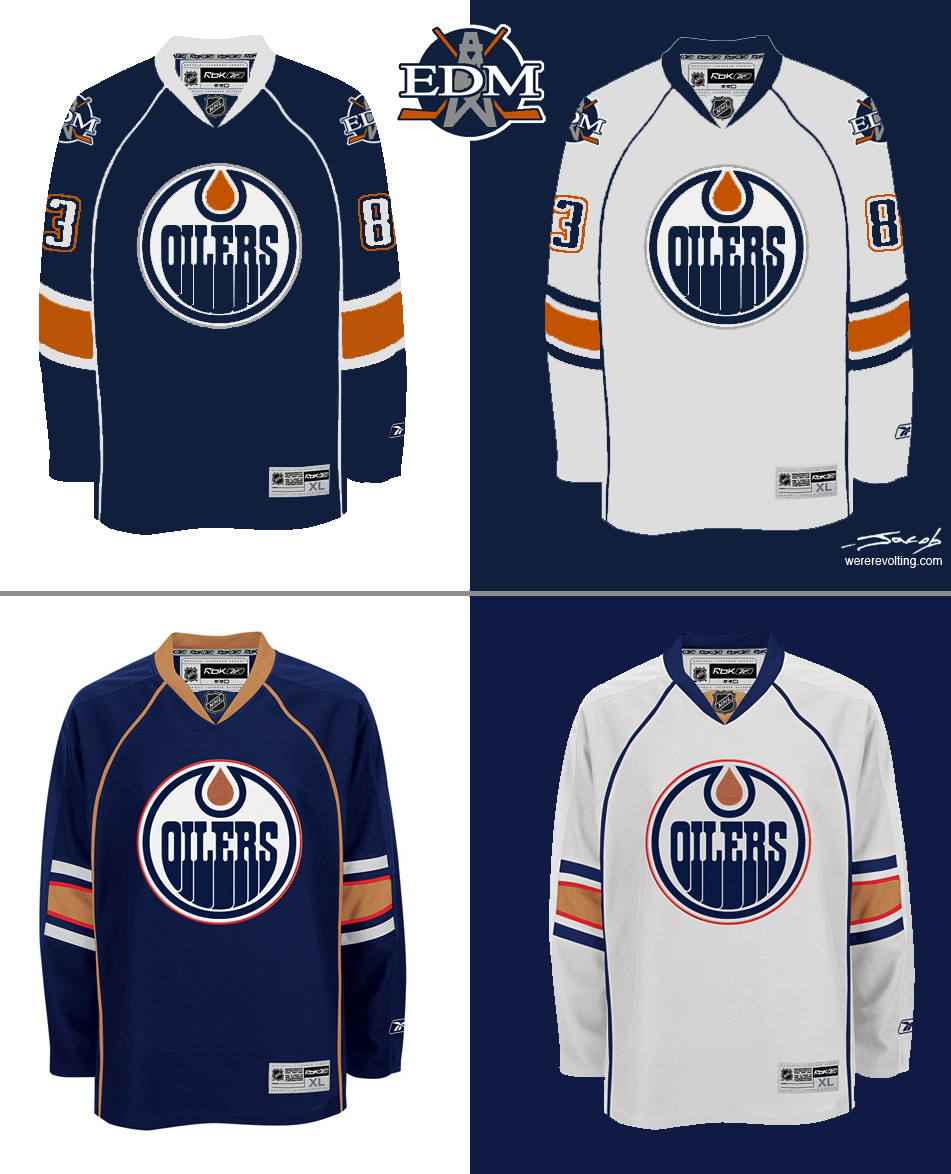
Edmonton (Take 2)
I kind of hoped I'd be over this by now, but I'm still annoyed by Reebok's new "uniform system", and especially the ones worn by the Oilers. I tried making small changes to the current design, but with unsatisfying results. And since Reebok has so generously provided me almost half a dozen templates to choose from, I thought I'd try something different:
I like this style. Modern lines, but clean and simple. I reverted to blue and orange once again; partially to connect with history, but also because it just looks good. The idea was to mix nostalgia into something interesting and modern. Call me crazy, but I believe you can look fresh and edgy and sell jerseys and all that important stuff without resorting to garish design gimmicks or turning off old fans. (I hope Pat LaForge is paying attention.)
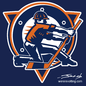
You'll notice the rigger is back on the shoulders. I know he has his detractors, and I admit he's kind of stupid if you really look at him. (What is he doing with that hockey stick?) But at this point I don't have anything else to stick up there, and the jersey needs a shoulder patch.
The main problem with this design is that it looks a lot like Tampa Bay, Ottawa and Pittsburgh's. This is tough to avoid in the Reebok era, but if we really wanted to stick it to the man, there's an easy way to do it:
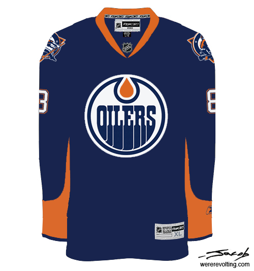
These are basically the Gretzky-era sweaters adapted to the Reebok cut. I ditched the orange cuffs and tweaked the colors. In my opinion this is the best thing the Oilers could wear.
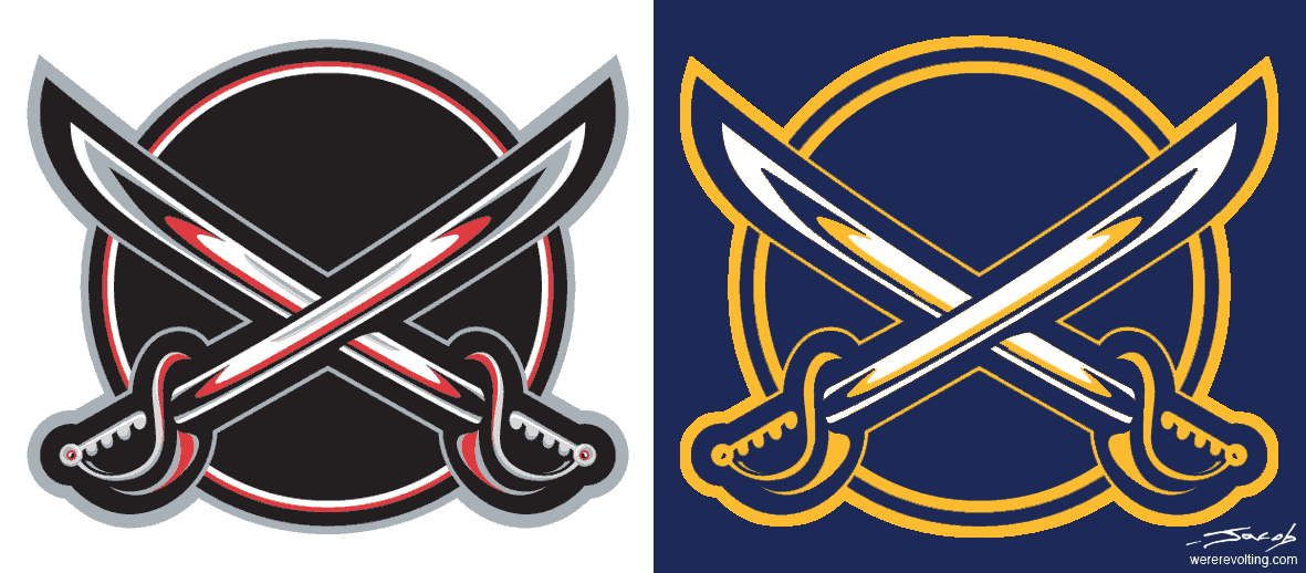
Sabres
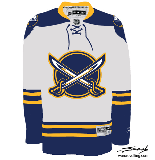
I've long been a fan of John Stabyk's Sabres concept. (Specifically the "classic home" jersey. As opposed to the "modern" one, which, distressingly, seems to be more popular.) But then I took a look at the classic sweater that inspired him, and I realized it's even better.
I'm not a hard-core traditionalist, but I do believe that what ain't broke oughtn't to be fixed, and in my opinion the Sabres' original blue sweaters were pretty near the best in NHL history. Solid logo, classic colors, perfect striping. All it needs is an update. So here's my version:

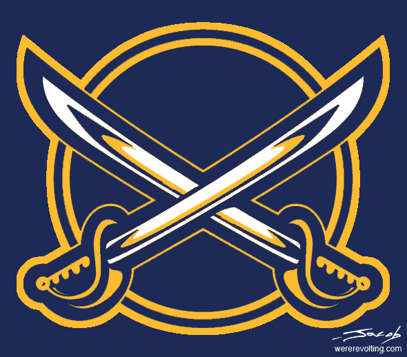
It's pretty close to the original, just with darker blue and a different crest. The logo is essentially the one from Buffalo's old third jersey. (Not only does it look good, but it actually features sabres! The team management should be forced - at gunpoint, if necessary - to include sabres in their next primary logo.) I swapped the colors and cleaned up some of the messy details.
The original white sweater needed a more substantial revision. Yellow-on-white stripes just don't work for me. (And it's made worse by the sleeve/waist switcheroo.) So I added some blue:
Originally I went with a buffalo-free shoulder patch as well:

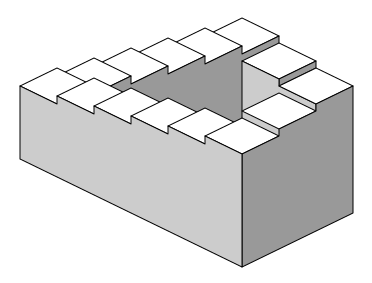
It needs some more work (there's a bit of an impossible staircase effect in the bottom half, which could be fixed by taking the sword out of perspective) but I think it looks good. However, since it seems to be required by law that all Buffalo sports teams wear a buffalo on their uniform, I figured I should stick one on the shoulders. (I don't mind logos representing a team's city or state or whatever, as long as they're not the main crest. Or consist of a lame provincial flag that clashes with the team's colors.)
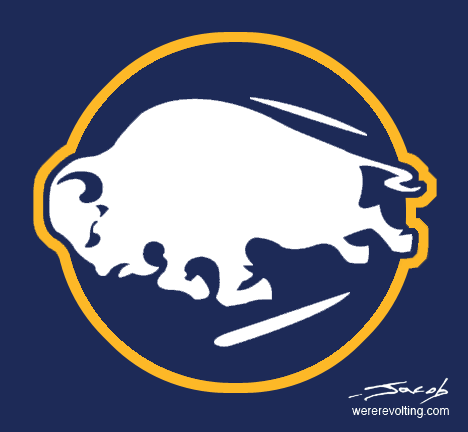
Obviously, I lifted that from the team's original logo. I think it looks alright, but I figured, hell, it was a good logo. Why not just use the whole thing?
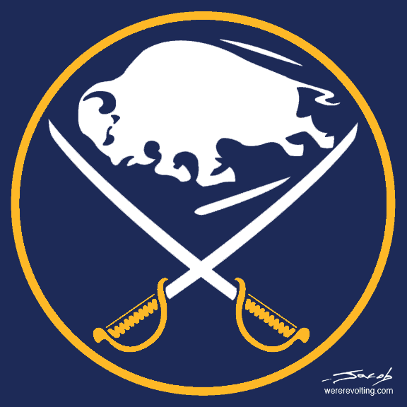
So that's what's on the shoulders, if you couldn't make it out.
Sharks
I thought the new San Jose jerseys were a bit weird, particularly the home teal. The teal/orange combination just doesn't work for me, so I took out the teal. I know that's heresy, but it's also dead sexy.
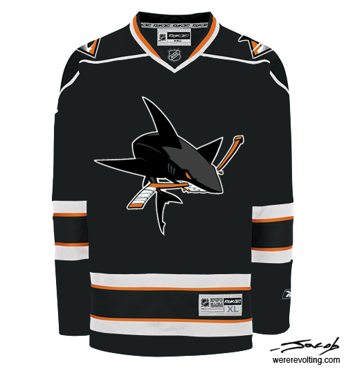
I also dropped the classic triangle-shark in favor of the full shark from their shoulder patch (a much better logo, I think) and put the diamond-fin logo on the shoulder. Here's a white version:

I don't suppose the Sharks would ever drop teal entirely, but the black version could be a pretty sharp third jersey. Or maybe it's just me.
Flames
I guess I'm biased, but I think one of the very few NHL teams whose new jerseys are worse than Edmonton's is Calgary (the Ducks might be the only other one). I could go on for pages about what's wrong with this jersey, but no one would read it. So I tweaked it a bit to accentuate some of its most glaring flaws. Can you can spot the changes?
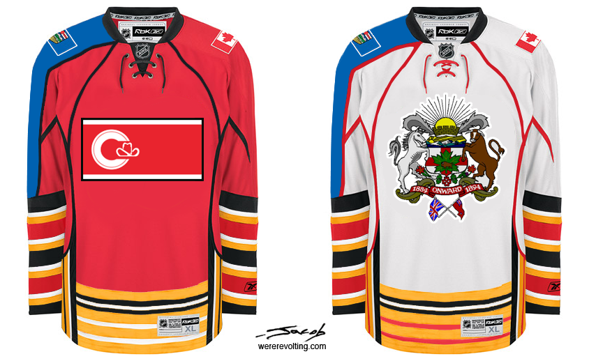
That's the official City of Calgary flag and crest, by the way. Who needs team logos when your have such beautiful regional insignias?
Unfortunately the armpit patches aren't visible in these pictures. For me they're the icing on the cake. I can just imagine the group who created these:
"I agree, they're still missing something."
"What if we put bullseyes in the armpits?"
"Perfect!"
These things must have been designed as a joke. It's the only possible explanation.
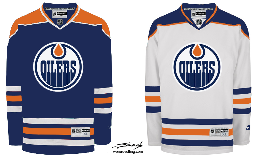
Oilers
Note (Nov 24): I have at least one more Oilers concept in the works. The stuff below is of course a huge improvement over what we're wearing now, but I think it would be best to ditch Reebok's apron-strings template altogether. Stay tuned.
I thought the new Oilers jerseys looked ridiculous, so I made my own. I can't sell you one, and I can't make the Oilers wear them, but it was cathartic for me to fix the Reebok design.

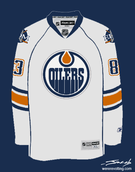
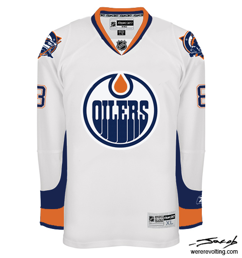
I used the new jerseys as a template. The color scheme is a fusion of the Gretzky era (orange) and the recent third jersey (darker blue, a touch of grey). The other major changes are stripes that go all the way around the arms (I really think this could catch on) and a new shoulder patch:
And here's my design beside Reebok's. Click on all images for larger versions.
Let me know what you think.
All images on this page are licensed under Creative Commons.

posted by Jacob
![]()


Jacob,
Fantastic work on saving both the Sabres and Edmonton oilers.
It is a disgusting shame that professional designers got away with some of the gaudy, tacky, and tasteless designs on the RBK Edge uniforms.
My hat is off to you. Well done.
Good stuff, sir!
Those Buffalo jerseys are awesome!
I thought I might get used to the new Oilers jerseys with time. Hasn't happened yet. Thanks for connecting the stripes, but that piping will always make me sad.
Thanks.
I'm not a big fan of the piping either. At the time I wasn't sure how I felt about it, but at this point I think it would be best to scrap it.
I've got a more traditional Oilers concept which I'll probably post in the next couple days.
Getting closer with the Oil, but like you said, too similar to too many other teams. Stupid templates.
That second set is really nice, though. Sure, horizontal stripes at the hem look weird with the goofy rounded cut of the Edge, but I'd rather have a minor problem like that than the many problems (or one big problem) we have now.
I wonder if making the bottom stripe on the white jersey blue would help the rounded hem problem. It'd just blend in with the pants then.
The rounded hem is a problem, but it can be fixed, sort of. The Rangers have started sewing theirs up. (More pics at their site.) It's unclear whether this violates league rules on altering jerseys, but they've been doing it for a while now, seemingly without repercussions. Reebok doesn't currently sell jerseys this way, but if enough teams start re-hemming them maybe they'll give in.
On the Minnesota jersey, I love that my home team is going back to green. If we have to have Minnesota across the jersey (boring) how bout adding the bear logo on the right chest. I think it would make a world of difference.
I agree that the Minnesota jersey is a little plain. I actually tried including the bear logo, but it looked kind of cluttered and awkward. It might work as a shoulder patch.
You're way off with the Sharks concepts. Most people who dislike the new jerseys hate the orange, so this would have been a better way to go:
No Orange
Ya, I know most Sharks fans would rather stick with teal. I tried removing the orange, but personally I think this looks better.
Another fan pointed out that the color scheme is quite close to those of two divisional rivals: the Stars and Ducks. So I don't think you need to worry about seeing these on the ice.
Post a Comment